Pink and Taupe in Interior Design
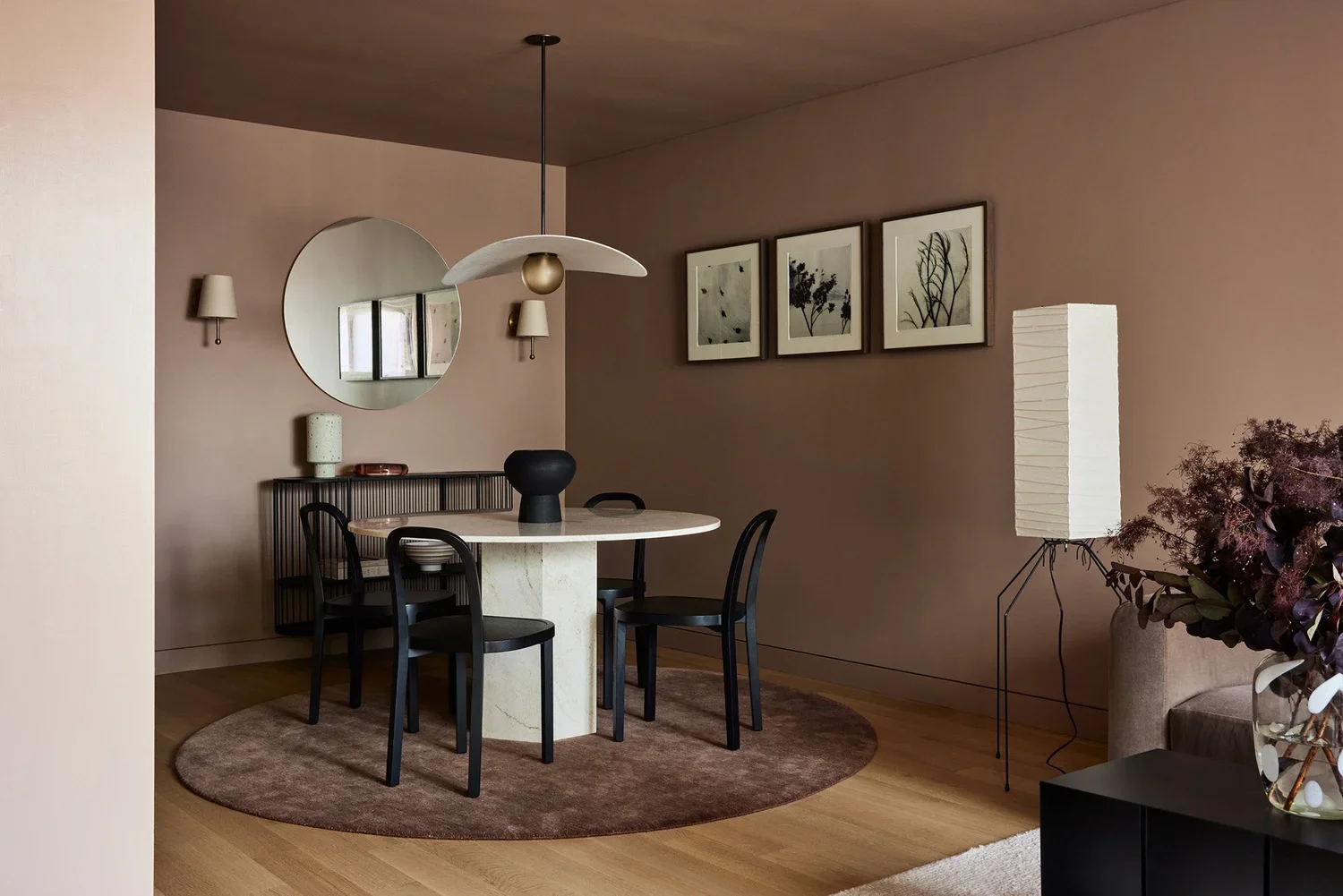
Grace Residence dinning room.
At Shapeless Studio, color is never an afterthought. It’s foundational, woven into the fabric of every project from the earliest sketches onward. Among the palettes we return to again and again, pink and taupe hold a special place. These understated hues create environments that feel soft yet complex and warm yet modern, offering the kind of quiet backdrop that allows a home to feel both thoughtful and enduring.
From Brooklyn townhouses to serene Hudson Valley homes, we’ve seen how pink and taupe bring depth, emotion, and a subtle vibrancy to a space. Here’s how we approach working with these colors and why we believe they deserve a place in more interiors.
The Emotional Resonance of Pink
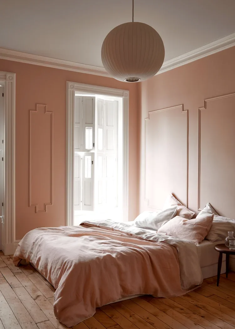
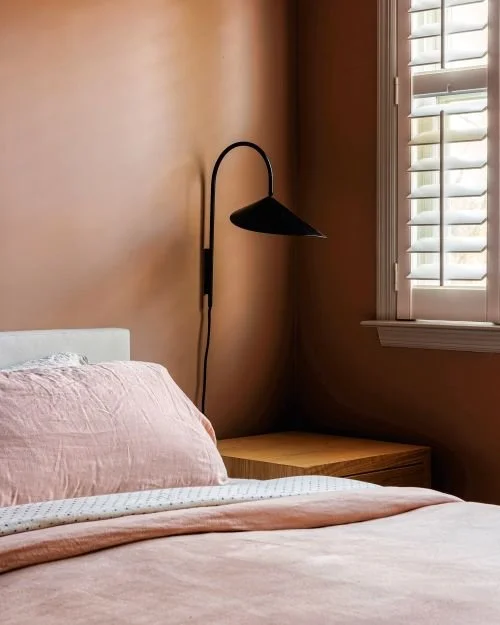
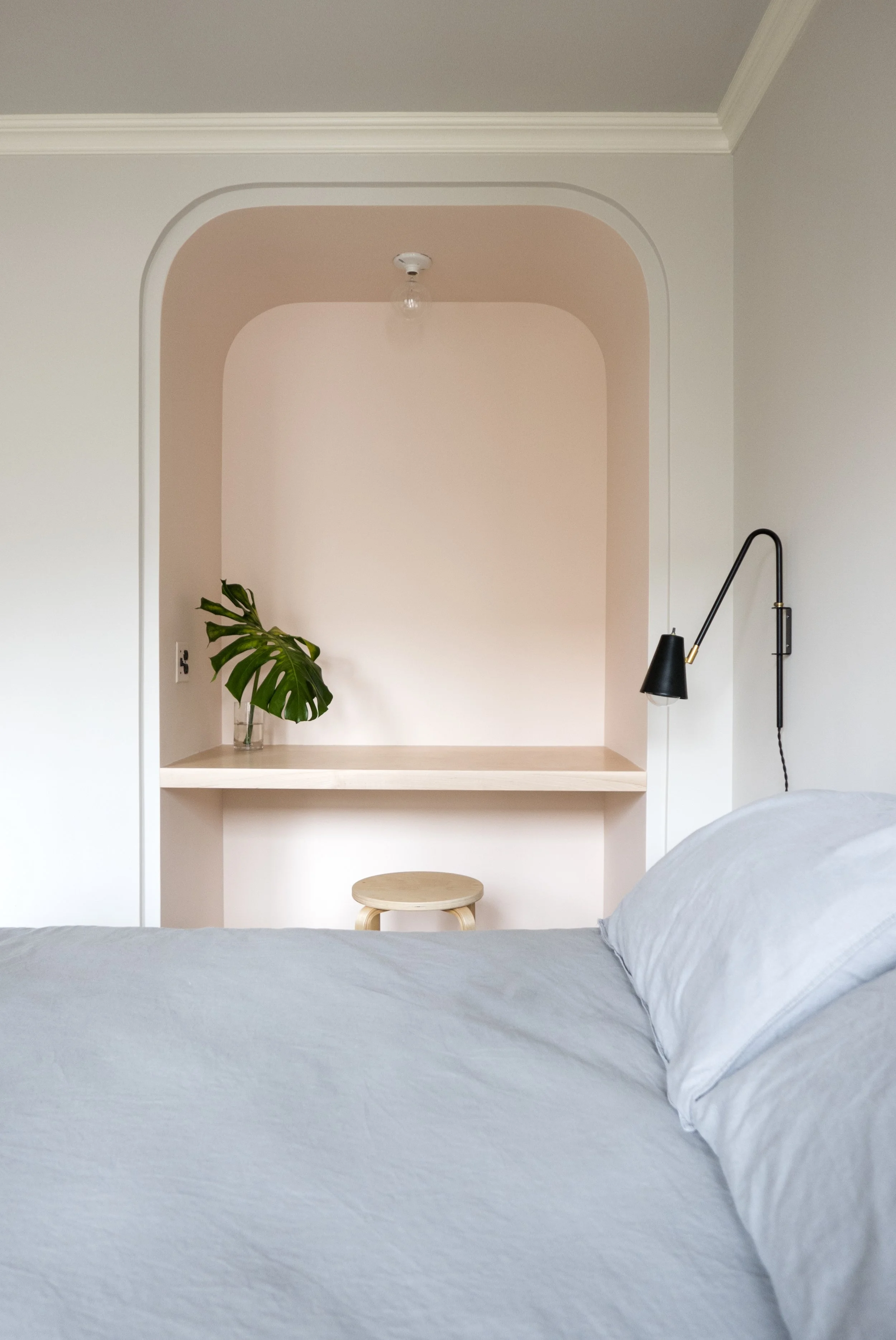
Putnum Townhouse bedroom
When chosen thoughtfully, pink is far more versatile than many people realize. It can be grounding or playful, sophisticated or serene. The key is finding tones with depth and complexity, shades softened by gray, clay, or brown undertones that feel natural rather than sweet.
In lighter spaces, pink has a remarkable ability to hold light. A soft, muted blush can gently envelop a room, shifting throughout the day as the sun moves across the walls. In bedrooms especially, it creates a sense of calm and intimacy, adding warmth without heaviness and color without noise.
We often think of pink as a quiet neutral. It brings subtle character and emotion while still allowing materials, textures, and furnishings to take center stage. What we love most is its immediacy. It feels personal, making a home feel distinctly its own. There’s a softness to it that invites you to slow down, settle in, and truly exhale.
The Quiet Depth of Taupe
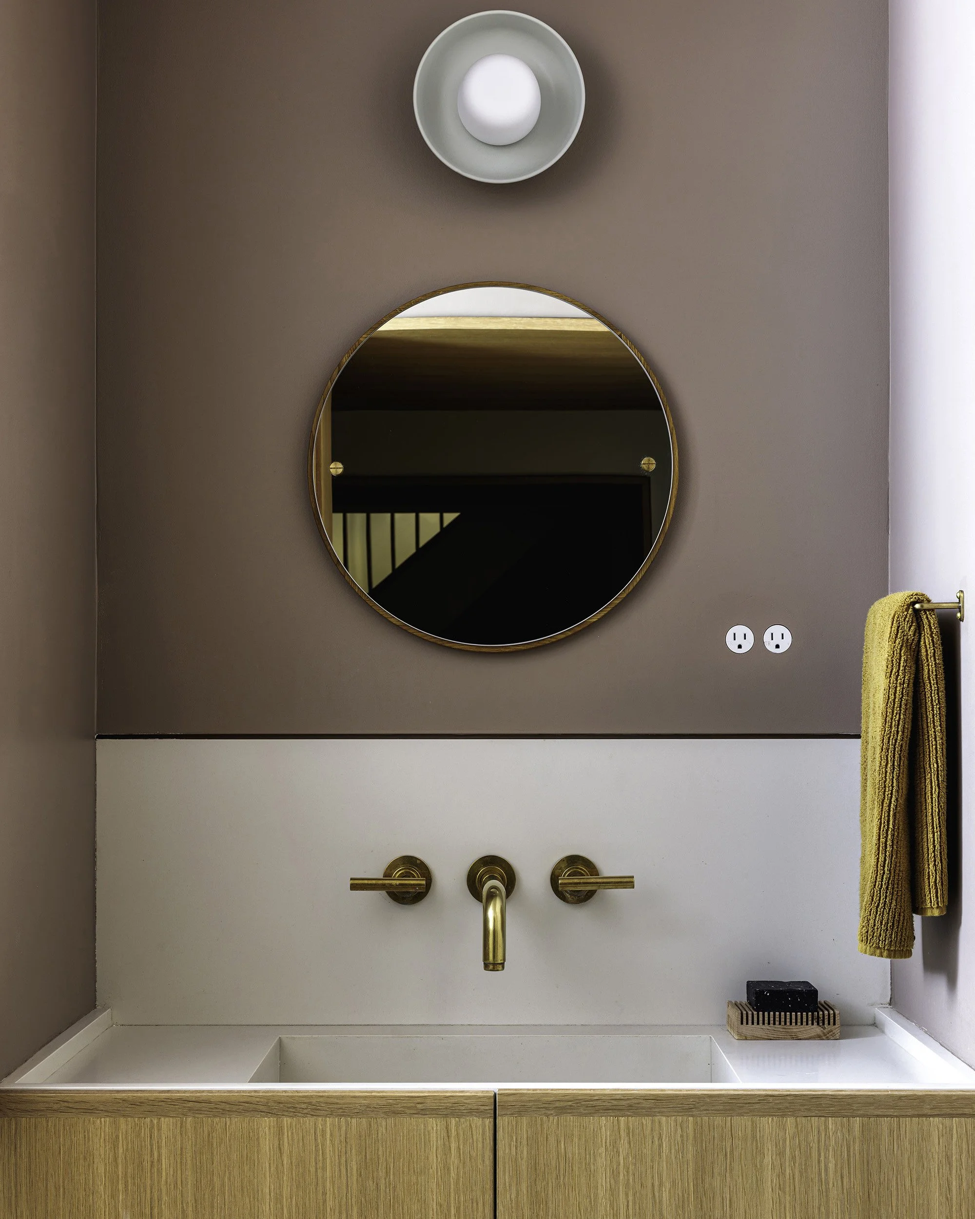
Irvington House powder room
While pink adds softness and warmth, taupe does the essential work of grounding a space. Sitting between cool gray and warm brown, it adapts effortlessly to its surroundings and shifts beautifully with changing light.
Taupe offers depth without heaviness and structure without stiffness. It creates a calm architectural backdrop that complements natural materials like stone, wood, plaster, and brass, allowing their textures to stand out. The result is a palette that feels layered and refined rather than flat.
Its strength lies in subtlety. Taupe rarely demands attention, yet it elevates everything around it. Richer colors, bold art, and sculptural forms read more clearly against it, giving a room cohesion and quiet confidence.
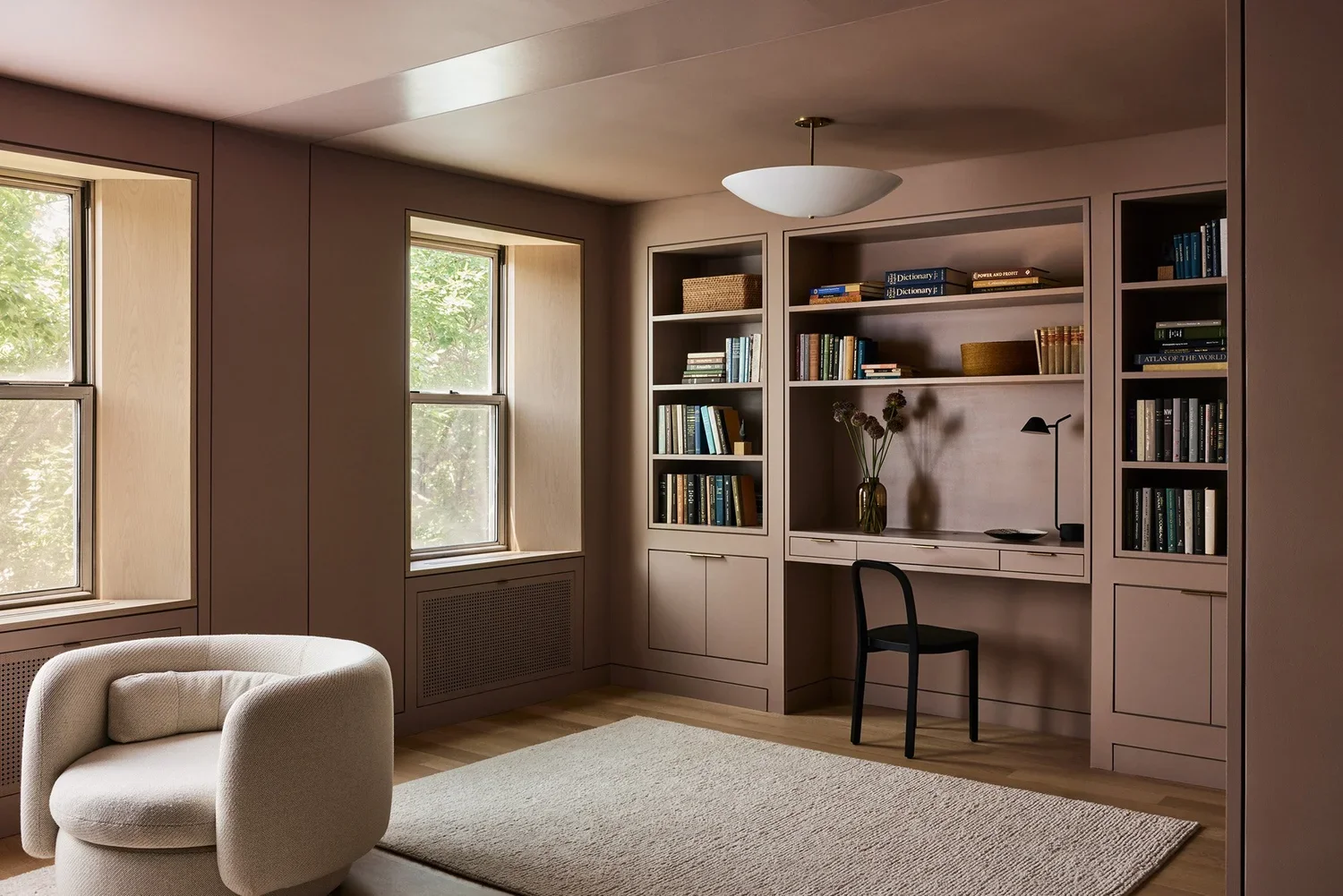
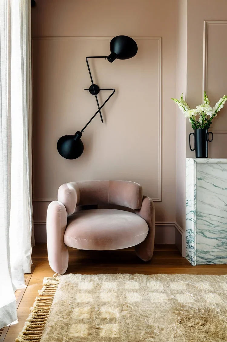
Grace Residence office
How We Choose the Right Shades
Color is deeply personal, but there are a few principles we follow when working with pinks and taupes:
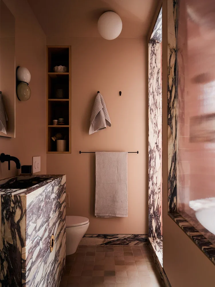
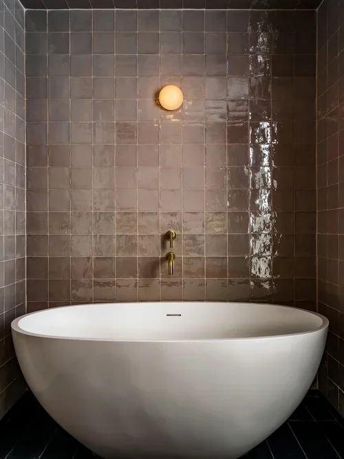
Prospect Heights Bathroom
Prospect Heights bath
1. Look to Nature:
The most timeless shades often echo the natural world: clay, limestone, weathered wood, dried roses. Pinks with brown or gray undertones and taupes with warmth tend to feel more sophisticated.
2. Pay Attention to Light:
Natural light dramatically impacts how color reads. A pale pink that feels soft and elegant in a south-facing room may look washed out in Natural light transforms color dramatically. We test large swatches and observe them throughout the day to understand how they shift.
Irvington House bedroom
Cobble Hill Townhouse bedroom
3. Balance Texture and Sheen:
Flat or matte finishes can make pinks and taupes feel velvety and rich. Meanwhile, layering materials like plaster, stone, and natural fibers against these colors creates depth and keeps the palette from feeling flat.
4. Trust Neutrals, But Take Risks:
Pink and taupe can act as gateway colors. Try them in a powder room, built-in, or feature wall to add depth without overwhelming a space. Even small moments of color can shift the entire mood of a room in surprisingly meaningful ways.
Putnam Townhouse guest bedroom
South Harlem bathroom
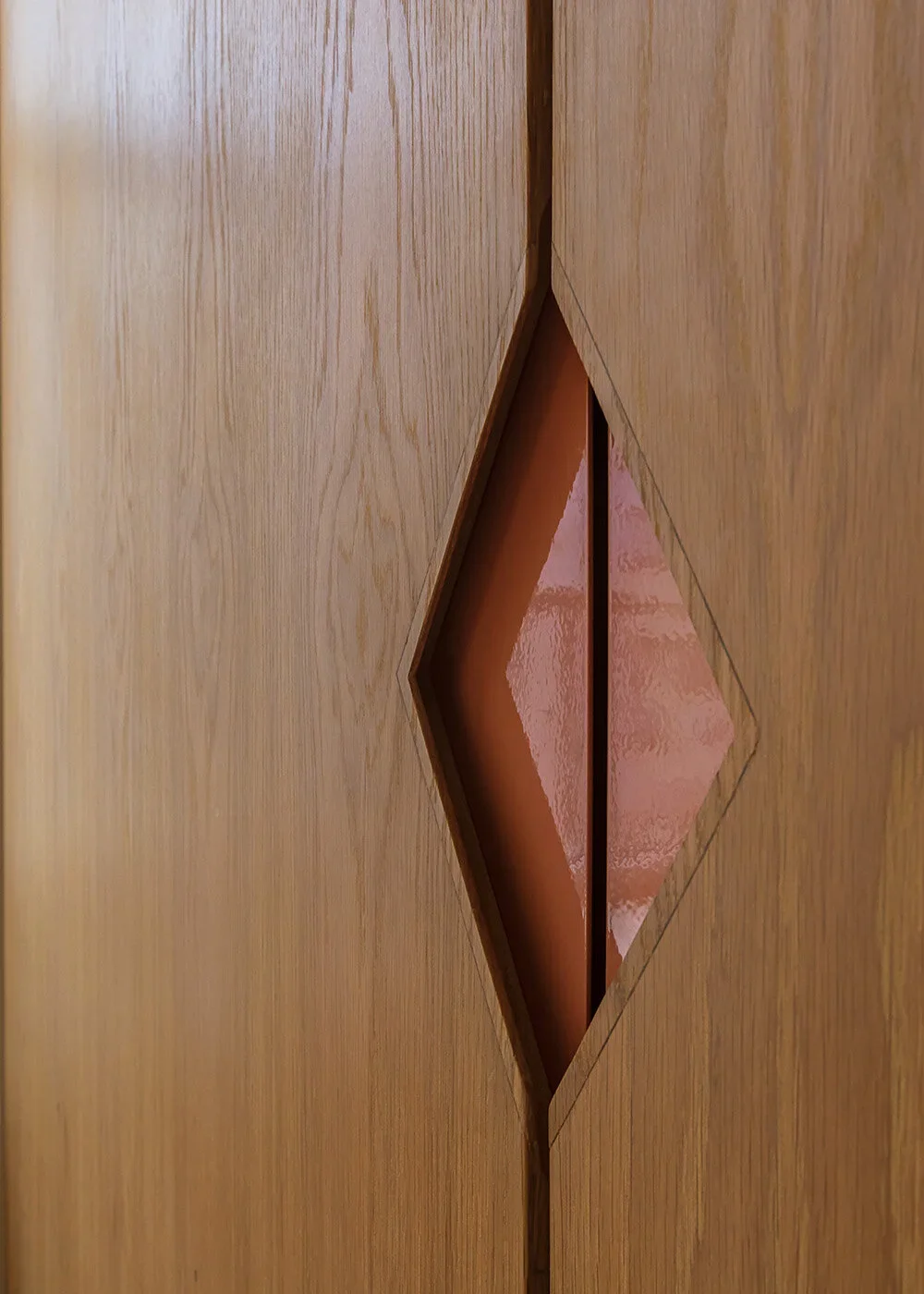
Pineapple loft pull detail
Why These Colors Endure
Pink and taupe have staying power because they speak to something essential about home: comfort, personality, and quiet beauty. They’re expressive without overpowering and flexible without fading into the background.
We think of color as a tool for storytelling, and these hues tell stories that are nuanced, textured, and deeply human. It’s why we return to them again and again and continue to explore their potential with every new project.
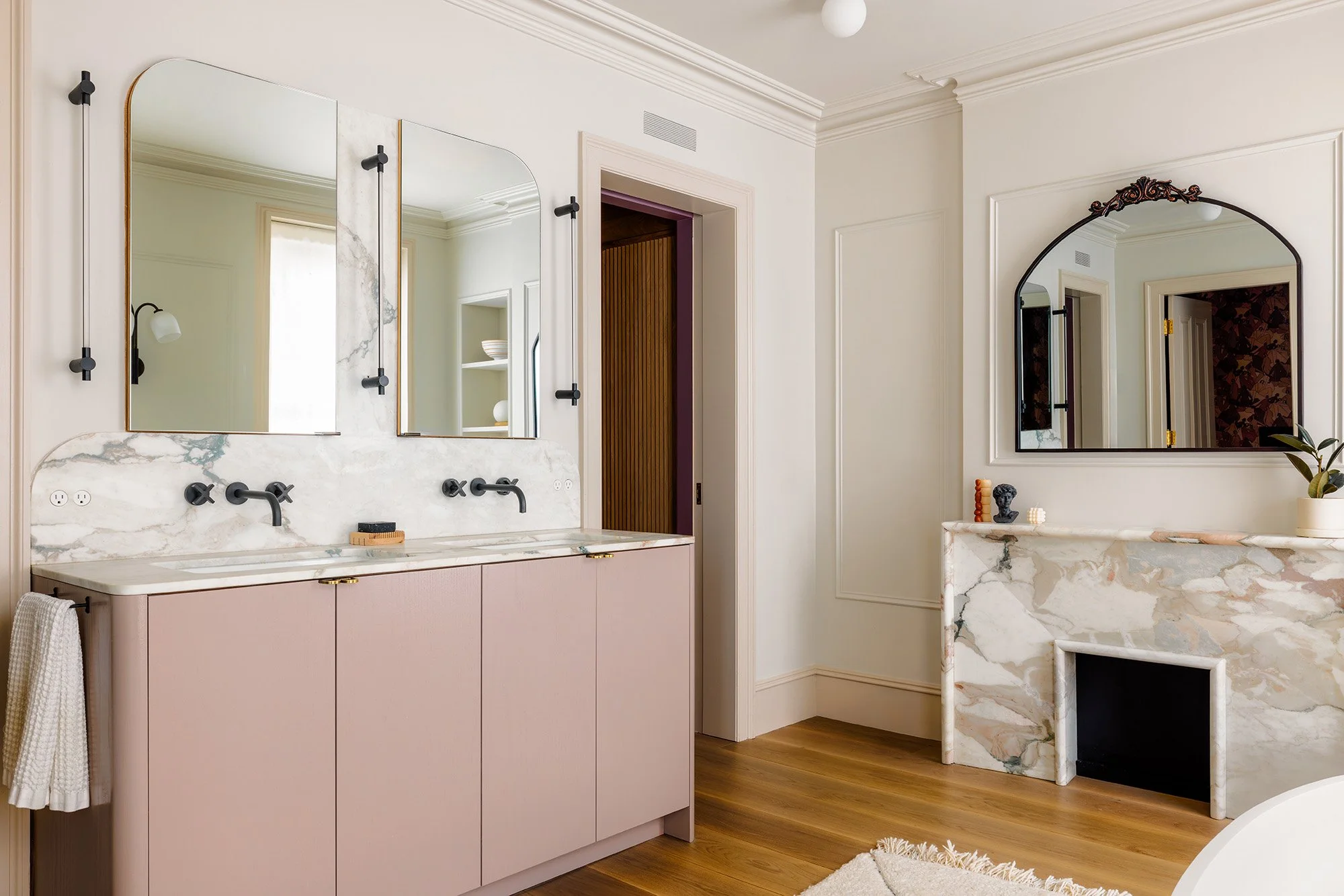
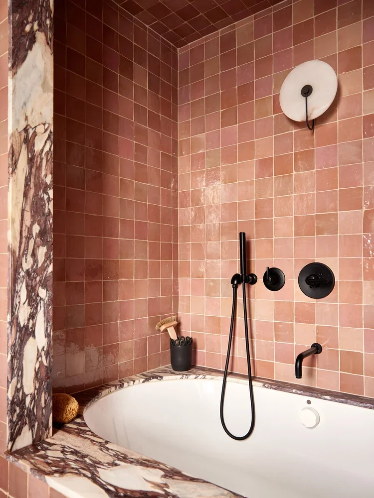
Cobble Hill primary bathroom


